Tuesday, May 8, 2012
The end
So after all this time my I.T project has finally come to an end. I have to say that it was not my favourite project of all time only becuase I don't really enjoy the whole drawing on computer type things. I still did learn a lot and thats what counts right? I started off by not knowing what Google SketchUp or Inkscape was and now I can make some cool stuff with both programs. All in all I was happy with the work I had done and all the things I learnt. I guess this is good bye internet, I hope you enjoyed my blog. We might meet again one day but time will tell. Thanks for reading! :D
Sunday, May 6, 2012
Construction complete
Hello internet, I still have no new greetings. Now with my logo's two main parts completed all that was left to do was to put them together and a few extra things on top of that. After changing some colours, resizing some shapes and adding a background I managed to get my logo to this stage.
Though the logo may look complete it was still not 100% finished. I still needed to write my name in some cool Russian font and add some sort of interesting slogan. I started with the Russian font hunt straight away. Within a few minutes I found the perfect font (http://www.dafont.com/kremlin.font). I downloaded it straight away and then started the installation process. This consisted of me unzipping the file and then dragging the font file into the 'Font' folder which is located in the 'Windows' folder. Since I have installed new fonts before this was very easy for me to do. However I did run into one problem; the text wasn't appearing in Inkscape. I then remembered some wise words I was once told, "when in doubt restart". So closed off Inkscape, opened it again and I could now find the font. After typing my name this is what my logo looked like.
I still needed some sort of cool phrase to complete my logo. Something that sounds very communisty (I am aware I made up a new word). The phrase needed to have words like 'Unity' or 'Hard work' or 'Capitalist scum'. Then it hit me like all my good ideas hit me; Unity through hardware. It has unity in it and it has a pun because you know hardware sounds like hard work and....there is a joy stick...okay it was funnier in my head.
Now my logo was complete and this is what it looked like.
I am so shocked that my end logo turned out as awesome as it did. I honestly thought that it might look a bit B-grade in the end but I was wrong. Even though the Inkscape side of my project was a bit rushed I still had the most fun doing it. I learned heaps about the software and I believe I could now use it again if need be. If I were to sum up my logo in a sentence I would say, "Simple but effective".
 |
 |
| Looks better already |
Now my logo was complete and this is what it looked like.
 |
| Now that is awesome! |
Construction continues
Hello internet, I have run out of greetings. Similarly to my previous blog post I will be tracing an object. Instead of a joy stick this time it will be a head set. This blog post might be a bit shorter compared to my others due to the fact that I am doing the same thing as I did in my previous post.
During the process of tracing I discovered something that would increase my productivity ten fold...or something along the lines of that. While using the 'Edit paths by nodes' tool I found out that I could smooth nodes. This button was located on the top tool bar and was the eighth from the left. This is what the button did to my tracing so far.
However though smoothed the shape did still need some more work on it to make it look even better. To do this I just moved the nodes around a bit to even them up. This is what it looked like.
After some time and a lot of node editing my end result looked like this.
 After doing this part of my logo I felt that it looked very good. I have definitely improved and I believe that the head set shows this improvement. I was surprised how much the quality of an object can be improved through simple node editing.
 |
 |
| Before using the 'smooth nodes' button |
 |
| After using the 'smooth nodes' button |
 |
| Much better |
After some time and a lot of node editing my end result looked like this.

Saturday, May 5, 2012
Construction begins
Hello internet sorry about my last post one of my friends thought it was funny to do that. Now let's get to business. My plan is now complete so I can begin with constructing (sounds fancier than making) my logo. There is only one problem but; my lack of drawing skills.
I do struggle to draw even the most basic shapes so at first I had no idea how I would manage to draw the headset and joy stick. I thought, "Too bad I can't just trace it." Then the solution to my problem hit me. Why don't I just trace it? But how could a trace it on Inkscape? After some thinking the solution to my problem had once again revealed its self. I would need to import the image I used in the planning blog post into Inkscape. With this image now in Inkscape I could, in theory, just draw on top of it. I then decided to give this a go and this is what happened.
I did manage to import the image of the joy stick into Inkscape which meant that my plan was already working. To do this I clicked on the 'File' drop down menu and found the 'Import' button. I then had to find my desired image but before I could locate it I needed to click the 'Files of type' drop down menu and then click 'All images'. This allowed me to see my jpeg but it would also work with gifs or any other type of image. I then pressed on okay and was faced with message asking if I wanted to link or embed the image. I chose embed so the jpeg would be in the Inkscape file so if I deleted the image by accident it would still be in my Inkscape file.
Now with my image ready I could trace it with ease. I was wrong, very wrong. It was easier than drawing but there were still some problems that I needed to face. With the 'Draw bezier curves' tool selected I could now trace the joy stick which was great but I had to do it all in one go. If I made a mistake I would need to undo it which means that the whole line is deleted not just the end segment. I could just do a few bits than push enter to finish the line but then to continue from that spot I would need to click on the very end and that would have proven to be very difficult. After trying a couple more times I realised that I was completely wrong. I could just do a little section then push enter and then continue the line. I would just need to click the end white box and the line would continue like so.

After a few lines here I ended up with this.
 After making these lines I needed some way to edit them because a few of them were not fully connected. I remembered from my previous blog post (the pacman one) that you could edit things through the use of nodes. So I thought, "Might as well try to see if it will work". I then clicked on the 'Edit path by nodes' tool and clicked on my drawing and it worked. I could now move my lines around with ease but I did find that moving them with the mouse or the arrow keys did make it move too much. So to fix this I looked at the tool bar and found boxes labelled 'X' and 'Y'. Thanks to my Game and Web class I knew what those things meant. If I wanted to move it right I would have to add to the X and if I wanted it to move up I would have to add to the Y. To move in the other directions I would only have to do the opposite. With a bit of the joy stick traced and neat I could then move onto tracing the rest of it.
While tracing I discovered something that helped me draw straight lines. While using the 'Draw bezier curves' tool I saw near the bottom of my screen something that said 'Ctrl: snap to angle'. So while holding ctrl my line would, as the description suggests. snap to an angle. This then made it a lot easier to create straight lines.
After creating some nice straight lines I discovered something by accident. I was holding the ctrl button to create straight lines when I pushed the right mouse button. I zoomed in but at first I did know how I zoomed in I thought I just did it using some form of magic. Once this happened a few more times I realised that I must be doing something to zoom in. After some random clicks I finally realised that by holding Ctrl and pushing the right mouse button you zoom and if you hold Shift while doing this you zoom out. Finding this out was very useful because the tool you are using stays the same so you can zoom in/out while drawing lines.
Once I had finished tracing my joy stick I was faced with another problem.After grouping all my lines I tried to make the fill of the object red and this was when I had the biggest problem so far.
Only certain parts of my object is painted black which is not what I wanted. I was confused on why only some parts could be filled while others could not. All the lines could have their colour changed so it must have been something that I did wrong. Then it hit me; I couldn't fill what wasn't there. With my lines I would draw about a line at a time, push enter and then move onto the next line. This meant that all I had were a bunch of different lines that were not connected but looked like it which then means that they did not form anything that could be filled. So to fix my problem I would have to trace my tracing but this time remember to make the lines connected, as I mentioned above towards the beginning of the post.
This is what my end product looked like after I turned down the opacity of the object.
 All in all I was very happy with what I managed to do and the problems I solved. I also think it looks pretty cool as well. Of course it was not a 100% carbon copy of the original but where is the fun in that. Now onto the head set.
I do struggle to draw even the most basic shapes so at first I had no idea how I would manage to draw the headset and joy stick. I thought, "Too bad I can't just trace it." Then the solution to my problem hit me. Why don't I just trace it? But how could a trace it on Inkscape? After some thinking the solution to my problem had once again revealed its self. I would need to import the image I used in the planning blog post into Inkscape. With this image now in Inkscape I could, in theory, just draw on top of it. I then decided to give this a go and this is what happened.
I did manage to import the image of the joy stick into Inkscape which meant that my plan was already working. To do this I clicked on the 'File' drop down menu and found the 'Import' button. I then had to find my desired image but before I could locate it I needed to click the 'Files of type' drop down menu and then click 'All images'. This allowed me to see my jpeg but it would also work with gifs or any other type of image. I then pressed on okay and was faced with message asking if I wanted to link or embed the image. I chose embed so the jpeg would be in the Inkscape file so if I deleted the image by accident it would still be in my Inkscape file.
 |
| A bit big but at least it is in there |

After a few lines here I ended up with this.

While tracing I discovered something that helped me draw straight lines. While using the 'Draw bezier curves' tool I saw near the bottom of my screen something that said 'Ctrl: snap to angle'. So while holding ctrl my line would, as the description suggests. snap to an angle. This then made it a lot easier to create straight lines.
After creating some nice straight lines I discovered something by accident. I was holding the ctrl button to create straight lines when I pushed the right mouse button. I zoomed in but at first I did know how I zoomed in I thought I just did it using some form of magic. Once this happened a few more times I realised that I must be doing something to zoom in. After some random clicks I finally realised that by holding Ctrl and pushing the right mouse button you zoom and if you hold Shift while doing this you zoom out. Finding this out was very useful because the tool you are using stays the same so you can zoom in/out while drawing lines.
Once I had finished tracing my joy stick I was faced with another problem.After grouping all my lines I tried to make the fill of the object red and this was when I had the biggest problem so far.
 |
| Hey it looks like modern art |
 | |
| It worked yay! |

Wednesday, May 2, 2012
Planning process
Hello internet how was your weekend? Now what does every good project need? Yep you guessed it a plan and if you didn't you know what the anwser is now. At the start of this Inkscape project I had an idea for my logo which had stuck with me ever since I had first thought of it. I wanted to do the hammer and sickle logo but make it a bit more personal. But what could I do to make this represent me? I thought that the two things would have to look like the original but still some how represent myself. Then it hit me; a head set. Now that the sickle part was taken care of I still needed to thing of something that could look like a hammer. I thought at first things like keyboards and mice but I was not happy with this. Then it hit me once again; a retro joy stick. So I know had the main concepts for my logo being a headset and a joystick. See below for pictures of my idea.
 |
| The orignal logo |
 |
| The sickle |
 |
| The hammer |
Tuesday, May 1, 2012
Ghosts
Hello internet how are you all feeling? Today I am going to attempt once again another tutorial for Inkscape. This one will teach me how to create my own ghosts from Pac man. Here is the URL http://howto.nicubunu.ro/inkscape_pacman_baddies/. This one looked a little bit easier than the one I attempted last time. I will re-writing the tutorial as I see it
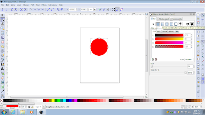
The first step was for me to create a circle using the 'Create circle' tool but I needed to hold the 'Ctrl' button while dragging it out. I used red for my ghost.
 The next step of the tutorial was to convert the circle into a path. I am not quite sure what that means but it was under the 'Path' drop down menu and the button was called 'Object to path'. Now instead of having three white nodes (those dot things around the object) there was now four of them. The next step was to add two more nodes. To do this I needed to select the 'Edit path by nodes' tool which is the little black triangle clicking a square. Now with this selected I needed to double click just below the two nodes on the left and right sides of the circle. This added two new nodes which I could now drag them to change the shape of the object. I needed to select the two new created nodes so I held the 'Shift' while clicking them. Now that they were both selected I dragged them both down to the bottom while holding ' Ctrl' so it only moves vertically. This is what it ended up looking like.
The next step was for me to add a few more nodes on the bottom of the shape. This was done in a slightly different way. I first clicked on the left bottom node, then shift clicked the bottom node and then I clicked on the 'Insert new node' button which is located on top tool bar on the most left hand side. I had to repeat this for the right hand node as well.
With my bottom nodes I selected the nodes to the left and right of the middle node. I then brought it up in the same way as I made the first ghost shape.
Now according to the tutorial the hard part was over. I now needed to create eyes for my ghost by making a white circle and then a smaller black circle. After making one I duplicated it and moved it to the left making sure it was in line with the original line. To do this I placed some guides on the top and bottom of the eye.
Now here the tutorial says we could stop and use it as a basic ghost but where is the fun in that. I continued with the tutorial to make my ghost look even better. The first step in this process was to select and duplicate the basic ghost shape. With this black shape I needed to give it a 'radial gradient' being transparent in the centre. After being confused I found that there was a gradient tool. It is called 'Create and edit gradients' and is the green square thing with two white smaller squares with a line connecting them. Now like all good software users I started clicking things hoping something would work. I did get a gradient but it was not what I wanted. Upon further inspection I found out that I had in fact been using the 'linear gradient' instead of a 'radial gradient'. To change this I needed to click the second square found under the drop down menu bar. Now with the right tool selected I tried again and it worked...but backwards. The black was in the centre and this is not what was needed. After ten minutes of raging I just googled it and found a video tutorial on it. After watching it I had an idea on how I would fix my problem.
I found out that in order to get this I needed to add things called 'stops'. This is found under the 'gradient editor' which can be accessed by clicking the 'edit' button which is located on the most left hand side of the gradient tool's tool bar. With this open I had to click the 'add stop' button. I can only guess that the term stop is used like the term layer would be used. so my first 'stop' was white and in the centre of the ghost. My next 'stop' was a gray colour which I made by using the colour slider near the bottom of the gradient editor window. After placing this on top of my ghost and moving the white gradient a little bit I was left with this.
Next step was to move onto the eyes. I needed to use the same process on the eye as I had used before on the ghost's body. This is what it looked like after doing this.
Now all the gradients were complete and I could start to move onto the final steps. These steps are adding a few highlights and a shadow. I started off with the top highlight by creating a white oval. I then placed it on the top left of the ghost. In the process of doing this I found out how to rotate an object. With the 'select' tool I doubled clicked the oval and I could not rotate the object using the arrows. Now I had to add some blur and change the opacity (found under the 'fill and stroke' shift+ctrl+f) so looked like a highlight opposed to a white oval on a ghost's head. I repeated this for a highlight on its left most stump thingy. This is what it looked like.
 It was now time for the shadow and to do this I needed to get a black oval below the ghost. Once I had this I needed to repeat what I did to the ghost body and the eyes. I then needed to add some blur and my ghost was complete.
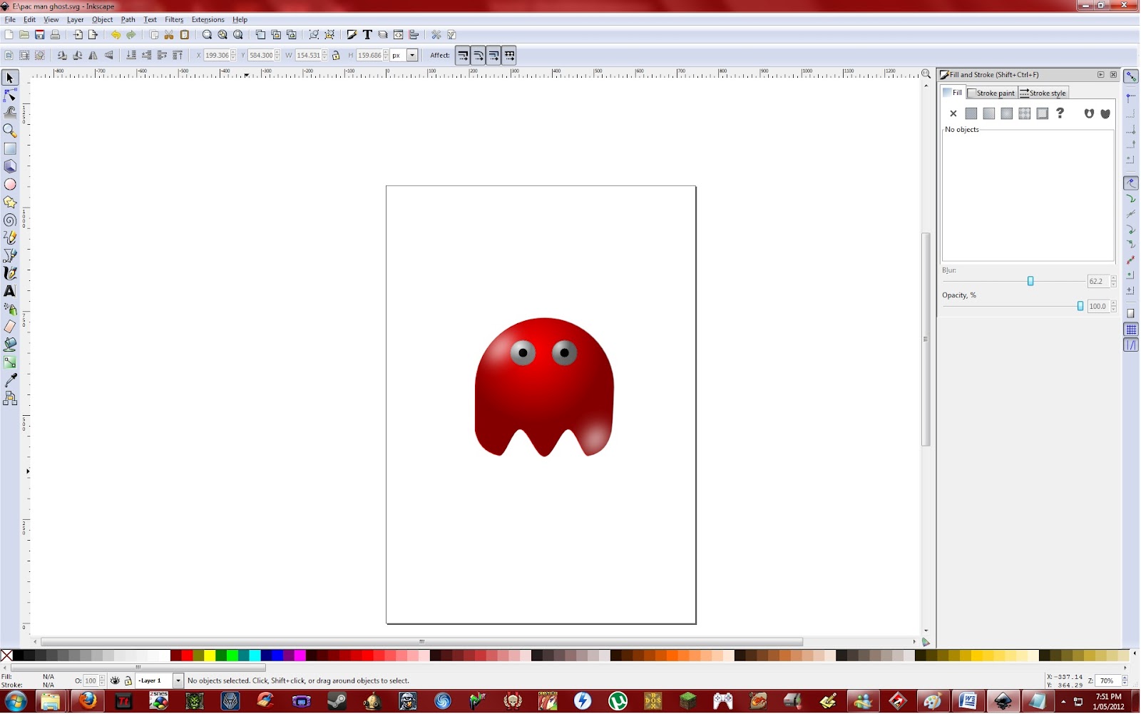
 Now that is a nice looking ghost. All in all I do like my ghost but there are a few issues with it. I don't really like the look of its eyes and the gradient is a bit dark. However as long as I learned some new things I am happy and boy did I learn some new things. With all the skills I have gained from this tutorial I believe that I am now ready to make my logo.
The first step was for me to create a circle using the 'Create circle' tool but I needed to hold the 'Ctrl' button while dragging it out. I used red for my ghost.

 |
| Very ghost like isn't it? |
 |
| A bit hard to see |
 |
| Now we are getting somewhere |
 |
| He can see into your soul... |
 |
| And it worked :D |
 |
| A little bit dark on the outsides but not too bad for my first try |
 |
| He can still see into your soul... |

Subscribe to:
Comments (Atom)